Medical News Blog Information

Middle East respiratory syndrome coronavirus (MERS-CoV): Age and Sex [UPDATED]

THIS PAGE IS NO LONGER UPDATED

This data visualization has been added to the single
MERS-CoV page now be found at..
http://newsmedicalnet.blogspot.com.au/2014/07/middle-east-respiratory-syndrome_17.html

A new static page on which I will update the MERS-CoV numbers as they relate to the age and sex of the people laboratory confirmed as infected.


Middle East respiratory syndrome coronavirus (MERS-CoV) by week and month...

To follow up yesterday's daily numbers chart, here we have the number of MERS-CoV detections by week (Chart 1) and by month (Chart 2). 

Not a lot of change from my last posts of these 18-June and 23-June - we are currently in our 5th straight day without any new detections being reported - and prior to this drought, there had been very few other detections for a while so we can now very clearly see the Jeddah-2014 (Kingdom of Saudi Arabia) major hospital-base outbreak peak's beginning and end.

We're also in the second half of Ramadan, putting us past the maximum likely incubation period for those visitors to the holy places that may have acquired MERS-CoV infection at the beginning go the month. A pretty good indication that MERS-CoV is not spreading among the community. It is still strange to me that a region that was yielding sporadic cases up until very recently, is now not yielding any such cases. Perhaps it's the improvements initiated under Dr Fakeih's watch, or maybe the hot, dry weather? It could be that camel contacts are reduced or that festivals are not as frequent in the extreme heat.  It would be great to see some scientific literature emerge on the Jeddah-2104 outbreak, on seroprevalence, on camel testing, gene/genome sequencing, studies of other animals or transmission investigations. Things have been very quiet on the publication front for some time now and we still know very little detail about the largest flurry of (known) cases to have occurred since 2012.

We'll wait and watch and see, I suppose.

MERS-CoV detections, worldwide (but mostly in the Kingdom of Saudi Arabia), by week.
Click on chart to enlarge.


MERS-CoV detections, worldwide (but mostly in the Kingdom of Saudi Arabia), by month.
Note the yellow star which highlights a 10-fold higher scale for 2014 y-axis (left-hand side) than in the 2013 numbers. Even 2014's puny June surpassed any month in 2013.
Click on chart to enlarge.

Middle East respiratory syndrome coronavirus (MERS-CoV) daily numbers...

Because I miss my charts, this is a quick one, made the old fashioned way (Excel and Adobe Illustrator).
MERS-CoV detections by date of illness onset (orange; when available, otherwise date of hospitalization or reporting) or by reporting date only (blue), each day since 22-March-2014. 
Click on image to enlarge.
A few things to note from this chart:

  • I've arbitrarily chosen to bracket the Jeddah-2014 outbreak as starting in the week beginning 17-March-2014 (MERS Week #106) and ending in the week beginning 19-May-2014 (MERS Week #114). There don't seem to be Jeddah-originating cases in the week after that, and case numbers are low (<5/day, similar to the same period in 2013) from then onwards...although this is not an exact science. For example, does one count those cases from the Al Qunfudah cluster that were moved to Jeddah hospitals? But it's a guide.
  • This chart has the daily case numbers (orange) based mostly on the date of illness onset. This highlights (again) the ongoing paucity of recent MERS-CoV detections which is great news for the Kingdom of Saudi Arabia (KSA). The map below previously posted here, does highlight an interesting questions. How are the small number of cases reported in June/July so widespread and where are the infections being acquired from? It's not spring (the camel calving hypothesis suggests human cases take off during the active birthing period; perhaps this is just the "ticking over", non-Spring norm for animal>>human acquisitions?) and there are no hospital outbreaks. Is this community spread? All the indicators we have point away from that. It is also a very busy time in the KSA right now with Ramadan having attracted visitors for some weeks. We have not yet seen cases appearing among those with underlying illness, an indicator or sentinel population for MERS outbreaks because they show the more obvious result of an infection. So these cases must be ongoing sporadic camel (or other animal, including goats which appeared in the recent WHO disease outbreak news) to human acquisition. Right? I'm looking forward to some widespread camel testing results from the KSA and some human seroprevalence studies would be very relevant too. Not sure what's taking so long for the latter to appear.
  • The plot of detection based on date of reporting (blue) is somewhat messed up by the found113 detections for which we have no date breakdown (see here for more detail or search VDU for found113). This means the detection all get assigned into 3-June, the date the KSA Ministry announced them. Yuck. It looks like those details are never going to materialize either. At least, my personal efforts to get date data from Prof Tariq Madani have failed, despite his public assurance that more detailed data could be made available to scientists who wanted it, and the WHO seem to have moved on to posting more contemporary cases in detail, skipping over the same level of detail for the found113.
The very good news is that Ramadan has not coughed up a plague of new MERS cases. The bad news is, we still don't really know the source of the cases that have been continuing to emerge in the KSA. Without knowing that we really don't have a handle on this disease, or this virus, at all.

Location of June/July MERS-CoV detections in the KSA.
Click on map to enlarge.

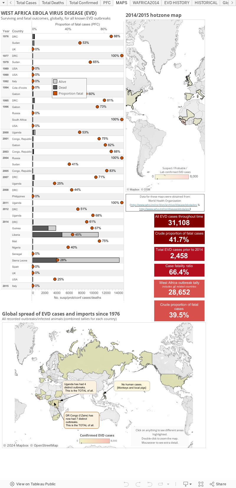
Ebola virus disease (EVD) cases, clusters and outbreaks mapped out...

The West African region epidemic (top map), including countries with imported cases and the totals from past Ebola virus disease outbreaks and the few imported monkey cases (the US & Philippines [hence zero human cases]) plotted by total numbers and country (bottom map).

These maps are best viewed alongside my Ebola virus disease numbers page found here.


The WHO create multi-page Situation Reports [2] and brief Situation Summaries.[3] They are currently presented on Wednesday and "additional updated figures" will be posted "as they become available any day of the week" (via eMail to journalists from WHO).

My totals include all countries that have hosted a case in, or sourced from, a West African nation. Countries include Guinea, Liberia, Sierra Leone, Nigeria (now EVD-free), Senegal (now EVD-free), the United States of America, Spain and Mali.

This is a static page but as of 21-Jan-2015 (AEST) I have copied the maps to the bottom of my main EVD EBOV|Makona (west African Zaire ebolavirus variant) outbreak page at:  http://newsmedicalnet.blogspot.com.au/2014/07/ebola-virus-disease-evd-2014-west.html


A note about the proportion of fatal cases (PFC): 
On these graphs, my PFC calculations for West African countries and the DRC are based on dividing the total number of suspect/probable/confirmed deaths by the number of total suspect/probable/confirmed cases for the same date. This is crude and may be a sizable underestimate of the true PFC.

It may be better to use the deaths at the most recent date divided by the total cases from 9-16-days  earlier (this number is not precisely known) to better account for the lag in time between presenting to a treatment facility and dying (for those who do not recover). 


Some estimates suggest the true PFC may be closer to 70%-80%. I don't have enough data (or smarts) to be able to calculate the lag for now so please be aware that the PFC above is likely an underestimate.


  • The figure above, as with all on VDU, is made for general interest only. It is also freely available for anyone's use, just cite the page and me (Dr. Ian M Mackay, PhD) please. It may be that I have misinterpreted the language in the reports (sometimes a little tricky to wade through) or miscalculated some totals based on the way data have been presented. 
  • Sometimes there are very country-specific differences in what gets presented to/via the World WHO DONs/SitReps which make this process less clear than it could be. I recommend you have a read and compare the data from each of the countries for yourself to understand these issues. 
  • As I've talked about previously,[1] these numbers are all volatile for a variety of reasons, some Ebola-specific, so regard this chart for its trends only.
  • I am only able to plot what is publicly available. To date, this does not include granular data with dates of onset, or daily data of any kind. The WHO have these data and you will see them become more available through their Situation Reports found here http://www.who.int/csr/disease/ebola/situation-reports/en/
References... 
  1. Ebola virus disease and lab testing...
    http://newsmedicalnet.blogspot.com.au/2014/04/ebola-virus-disease-and-lab-testing.html
  2. Ebola virus disease outbreak Situation Reports (SitRep)
    http://www.who.int/csr/disease/ebola/situation-reports/en/
  3. Ebola virus disease outbreak Situation Summaries (SitSumm)
    http://apps.who.int/gho/data/view.ebola-sitrep.ebola-summary-latest?lang=en

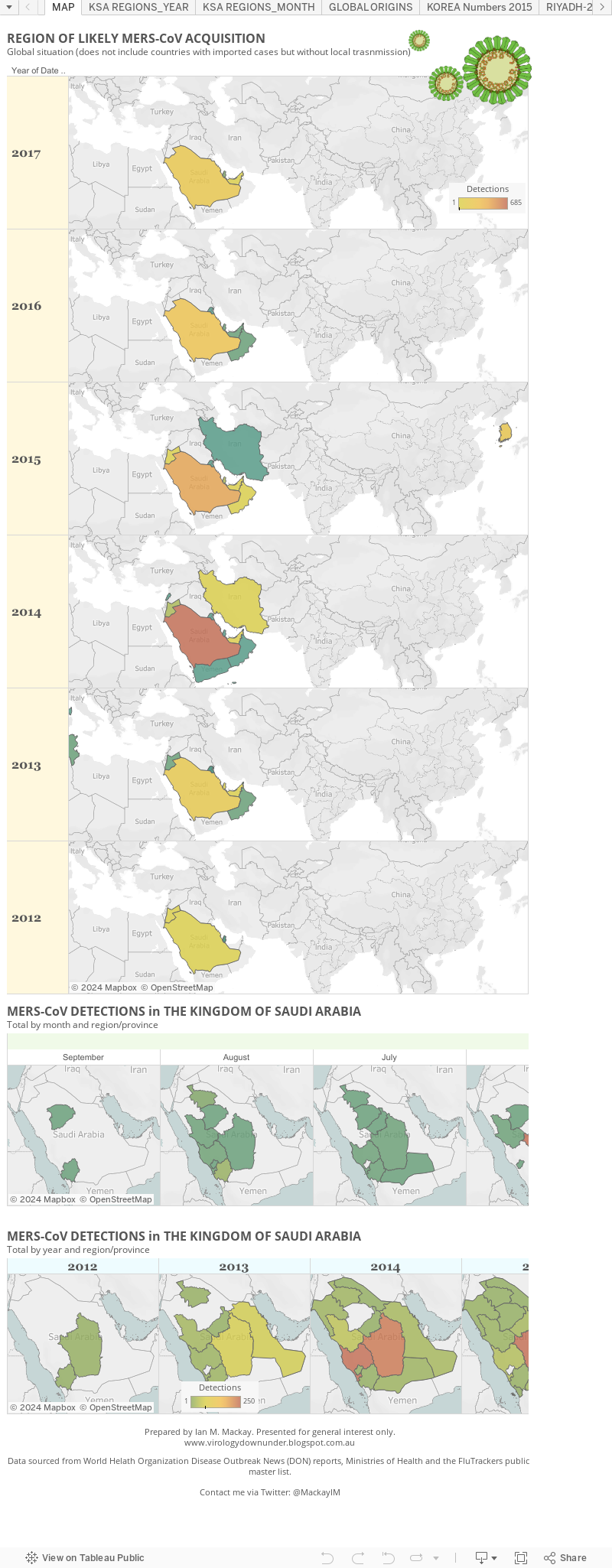
Mucking about with MERS and maps...

Yes, some more of that stuff with the Tableau presentation stuff.

This one shows the MERS-CoV cases on a map by the region they were most likely acquired in. So that means it doesn't show all the site to which cases arrived via export, just their likeliest point of origin.

Because we have no individual case details about the 113 "found" Saudi Arabian cases from 3-June, I've taken some liberties using the hints provided by the World Health Organization to put this figure together. It will be a little out on the (29) of the found113 that occurred between 5 May 2013 and 28 February 2014 but its the best I can manage with that big data gap.


Words of wisdom from a Master....

Prof Vincent Racaniello (he of the TWiV netcasts and Virology blog) took another step towards being the Yoda of contemporary virology communication using social media.

Earlier this morning (my time), while live Tweeting from the Australian Society for Microbiology's (#2014ASM) annual meeting in Melbourne, Prof Racaniello imparted these words of wisdom. This came out during a Tweet exchange with @NewProf1 about how to find some balance as a scientist engaging in social media communication in addition to having a life, succeeding at work...and personal hygiene.


Interesting how close those words are to Yoda's...
 No.
Try not.
Do. Or do not.
There is no try.
Oh, and if you are at the ASM this year - Tweet something for crying out loud!! 

Get into it. 

Create a Twitter account right now - just use it for work related stuff and follow a few people. Social media is, among other things, a great way to get another view of science. And if you engage with the public a little, just around your field of interest to start off with, you might be amazed at how positive and personally rewarding it can be. Not to mention how widespread your reach can become compared to a standard journal publication paradigm. Think of it as another way to look at impact. You may even pick up some collaborations.

At the very least remember, teaching is a great way to learn.

Like Us

Blog Archive