Medical News Blog Information

Showing posts with label outbreaks. Show all posts

Middle East respiratory syndrome (MERS) coronavirus: Outbreak in South Korea

This data visualization was created using data from FluTrackers, the World Health Organization and the Korean Broadcasting System (KBS).

Wherever possible, the dates are those for a case's onset of illness, but if that is unavailable then the date for hospitalization or if that is unclear, the date that case was reported.


Because the WHO obviously have more detailed information, I recommend you keep an eye on their site, so long as it is being maintained, for more accurate epidemic curves.



.
References...

3.  World Health Organization pages
Main landing page on MERS and MERS-CoV (includes link to WHO line list under General Information)
http://www.who.int/emergencies/mers-cov/en/
Disease Outbreak News pages
http://www.who.int/csr/don/don_updates/en/
 
News on the current situation
http://www.wpro.who.int/outbreaks_emergencies/wpro_coronavirus/en/
Summary of Korean statistics-rapidly updated

http://www.wpro.who.int/outbreaks_emergencies/summary.of.MERS.stats/en/

H7N9 outbreak #3 underway?

What better way to start 2015 than a snapdate!! For those who are new to them here on VDU, they were initiated here and defined here as snap updates - posts that don't have lots of detail and chat...although they almost always end up having lots of chat!

Figure 1. H7N9 cases by week of onset (or hospitalisation
or reporting dates of the preferred onset date was
not made public).
Click on image to enlarge.
This one is an update of the situation of one of the many avian influenza viruses ("bird flus" if you must) around again - avian influenza A(H7N9) virus, or just 'H7N9'.

In Figure 1, I've taken the huge liberty of adding in the start and end dates of the 3 outbreaks of H7N9 to date; and in doing so, I've said that China is in the early stages of one right now. I may well be wrong of course - this is a blog and these are my opinions - but it looks that way to me. 

Figure 2. China's northern laboratory network influenza
surveillance data up to Week 51 of 2014. [1].
Click on image to enlarge.
The case numbers for H7N9 in Figure 1 have been above zero for a little while and in particular November looked like a busy month (see weekly and monthly tallies here). Keep in mind that there is also a reporting lag - the time between date of onset (obtained from more detailed World Health Organization data) and the date the case was publicly reported (I rely on FluTrackers line list for these details). That delay can be a month or more on occasion; up to 38-days in late December. I suspect this is because China reports cases to the WHO in batches, something instigated toward the end of the 1st and 2nd outbreaks. So I suspect we will see more cases assigned to December, during reports that come out in January.

But it look like 'tis the season for influenza in humans in China (see figure 2 and the Chinese National Influenza Centre [2]) - and as some of us have discussed on Twitter, this is most probably due to the changes in weather (environmental conditions) which result in sustained viral survival on cough and sneeze-contaminated surfaces and in wet and dry propelled droplets and droplet nuclei; in both man and bird (see Hong Kong avian influenza detection report dates [3]). 

That sustained survival may well be all it takes for more of us to pick up an infectious viral dose.

Once the seasonal influenza viruses get a foothold in us, they spread well, causing disease in those who are susceptible and probably a bunch of unnoticed infections in those with previous exposure to that strain plus a healthy immune memory of that intrusion. By "seasonal influenza virus, I mean those that replicate in and circulate efficiently among humans, as opposed to the relatively inefficient avian subtypes.

So stay tuned to H7N9; it's not yet very good at spreading between humans but its established in birds and has been spilling over into humans since at least the beginning of 2013. We know how influenza can deal us a rough hand if the stars and its genetic segments align favourably (for it). Oh, and the continued reliance on fresh chicken obtained from and killed at live poultry markets. The majority of cases have very clearly had contact with poultry as defined by the WHO. 

References...

  1. http://www.cnic.org.cn/eng/show.php?contentid=738
  2. http://www.cnic.org.cn/eng/surveillance.php
  3. http://www.chp.gov.hk/files/pdf/global_statistics_avian_influenza_e.pdf

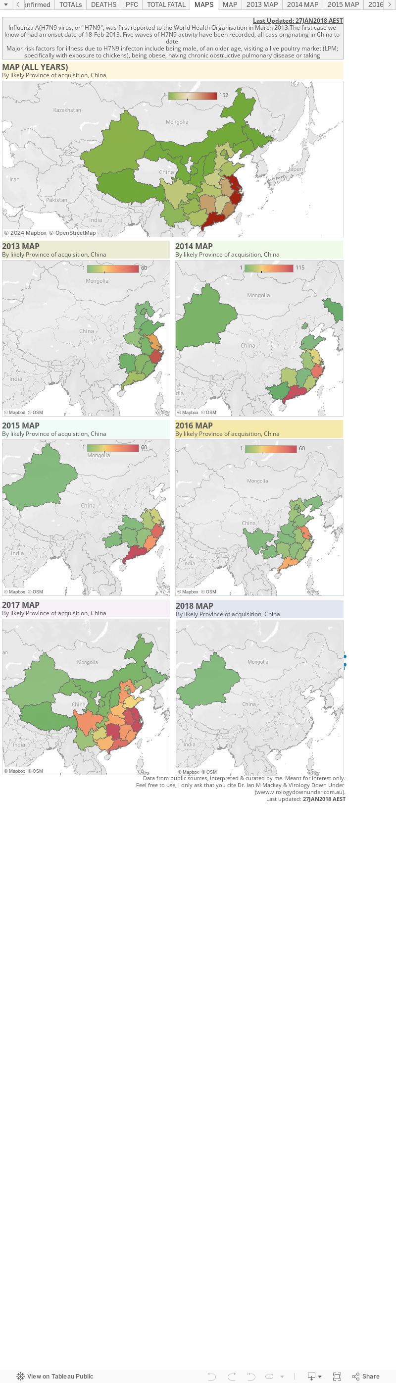
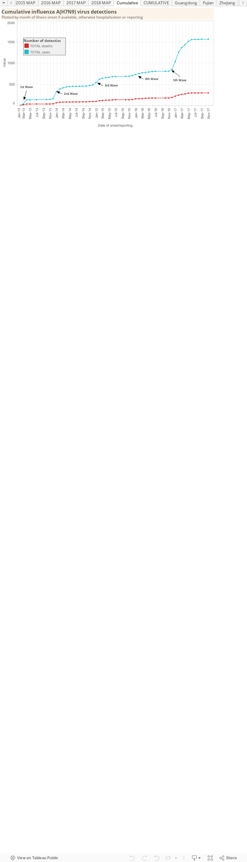
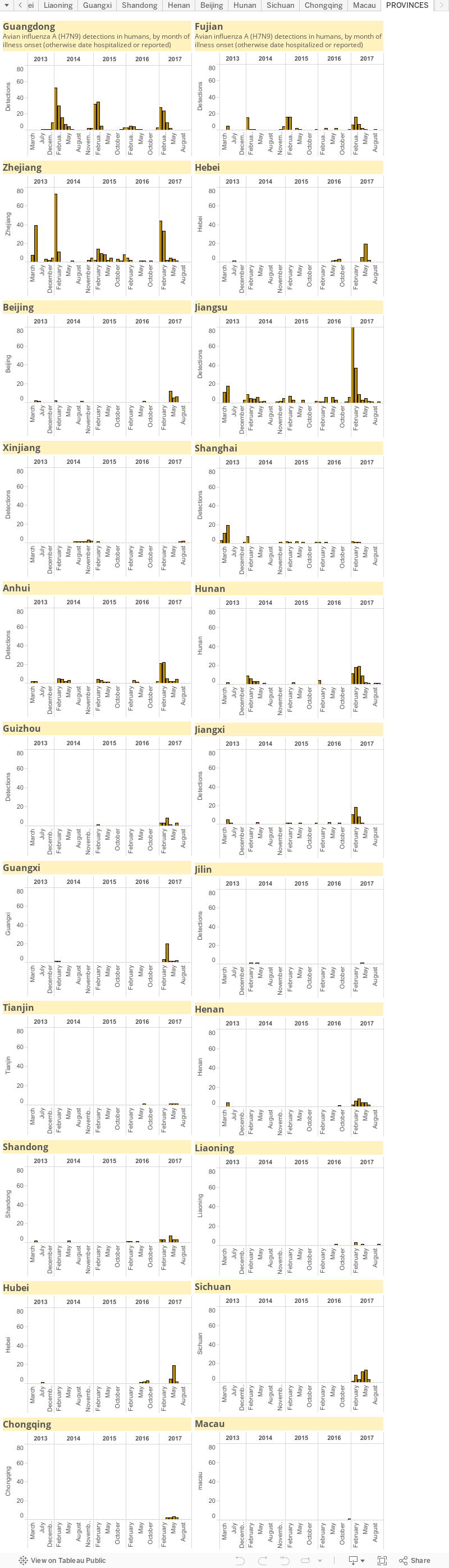
Influenza A(H7N9) virus: detection numbers and graphs...

This is a static page that will house my graphs of influenza A(H7N9) virus ("H7N9) numbers produced by the various Ministries of Health for the provinces and municipalities of China, the World Health Organization and FluTrackers.

They may take me a little while to get back up-to-date in this new format so stay with me. I will Tweet each update as I do for MERS-CoV and Ebola virus updates.

There is also an accompanying map page which for now is located here.


Reminders: 
  • The graphs above, as with all on VDU, are made for general interest only. They are also freely available for anyone's use, just cite the page and me please. The data can be downloaded by clicking on the "Download" link at the bottom-right of each dashboard. It may be that I have misinterpreted the language in the reports (sometimes a little tricky to wade through) or miscalculated some totals based on the way data have been presented.
  • In any outbreak, epidemic or pandemic caused by a know or emerging pathogen, the numbers presented publicly, and used in these graphs, are expected to represent only a fraction of all the cases that have and are occurring. This is just the nature of the imperfect biological'ness of these events.
  • I am only able to plot what is publicly available-you could do this too. No secret associations or back-room deals provide me with these data.

Case number changes between Ebola virus disease reports...

This is one of my favourite charts for following the Ebola virus disease outbreak in West Africa because it shows how things are changing from report to report. 

It plots the total number of suspected, probable and laboratory-confirmed cases between reports - which is a measure of change over time that is not cumulative.

That's not to say that understanding this chart is easy for everyone...as with everything, what you take away from it may be heavily influenced by your own perspective and your background in reading graphs. I have written something about how to read some of the graphs on my blog here, which may be helpful too.

Uses World Health Organization data up to and including the Situation Report from the 5th-Sept, 2014.
Click on chart to enlarge.
I've marked up the last three periods between reports to highlight that the time changes differently. You can see this for yourself if you look carefully at the horizontal or "x" axis (the one that has the dates) and look at where each dot lines up with its date. Some are further apart than others. 

You can also mouse over the dots on the interactive version of the graph here. That will tell you the dates. THe subtraction is up to you though!

The lines joining the dots here suggest what is happening between the WHO Reports, but the line do not actually use any real collected values...because we don't have them to plot. 

Technically, a bar graph would be more accurate, but I find a line graph easier to read at a glance. So do remember - we don't know what is happening between those dots. We're just presuming it.

Recorded Ebola virus disease (EVD) outbreaks throughout time...

A guide of case total confirmed cases and those who died from 
Ebola virus over time.
Sourced from Public Health England website [1]:
Click on chart to enlarge.
A quick chart to highlight the larger and smaller outbreaks and importations of EVD and Ebola viruses, respectively, that have been recorded worldwide since 1976.

I've added in the current tally of 167 suspected/probable/confirmed cases for the 2014 Guinea outbreak but this number is inflated compared to the other entries on the chart because those are reportedly based on confirmed cases; only around a third (59) of Ebola cases in the current outbreak have been confirmed to date.

Thanks to @Pawixx for steering me to the PHE page.

Please note that these numbers differ a little from the World Health Organization's Table [2]. Solving that discrepancy is a problem for another day.

Source...

  1. http://www.hpa.org.uk/Topics/InfectiousDiseases/InfectionsAZ/Ebola/GeneralInformation/
  2. http://www.who.int/mediacentre/factsheets/fs103/en/

Like Us

Blog Archive