Medical News Blog Information

Showing posts with label H7N9. Show all posts

The third outbreak of influenza A(H7N9) virus seems to be over...

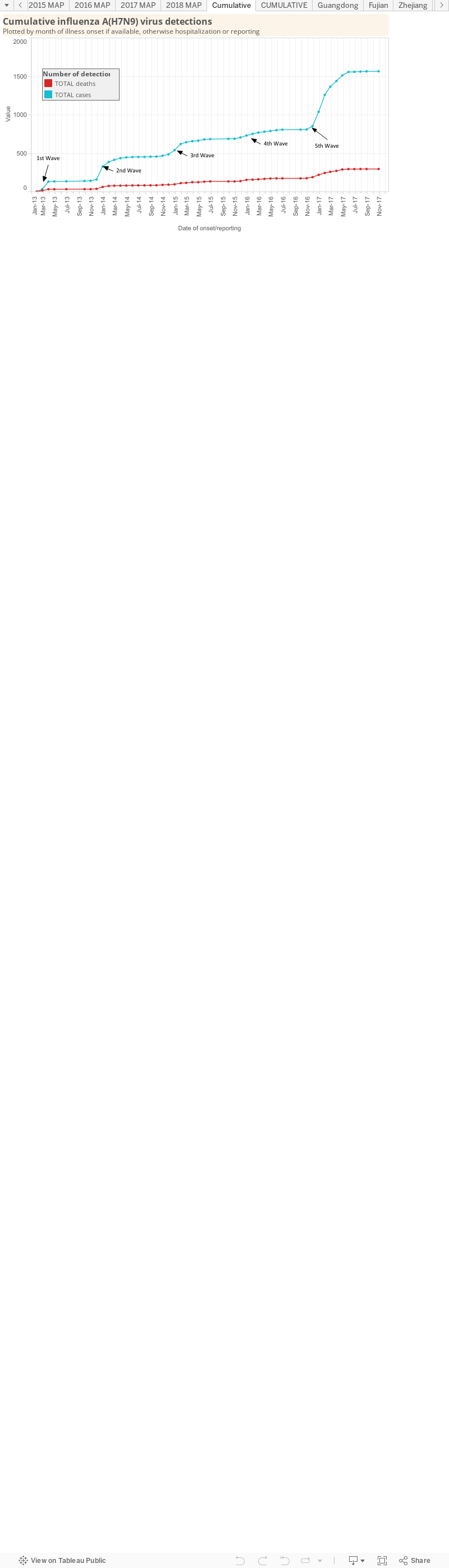
Cumulative curves of reported H7N9 cases and deaths in humans.
Click on graph to enlarge.
By the looks of the curve on the right, the rush of cases that defined the third known outbreak of the low pathogenicity avian influenza A virus subtype, H7N9, is over...for another season anyway. 

If we get into the nitty gritty, as I have below, there are a couple of interesting things to see. First though - let us remember that these are just reported data:

  • there may have been some cases that were not reported for whatever political, medical, social or personal reasons - these data are an idea of what happened - look at the rends and don't get hung up on the specific values
  • the overwhelming majority of the cases have reported to a healthcare facility with respiratory disease due (presumably) to either infection - we have no idea how many other people have been infected, what proportion were mild or asymptomatic (as I've discussed e.g. here and here, so we know it is possible). It could be half as many again, or 100 or 1,000 times as many.
  • these are only cases that have been examined with a laboratory test (as far as we know) - there may have been many other cases of "influenza-like illness" that did not get sampled and tested but were managed under (or not) the assumption that they were influenza of some type, subtype or strain.

Please note-the graphs used here can all be found on my fixed interactive H7N9 page at:http://newsmedicalnet.blogspot.com.au/2014/11/influenza-ah7n9-virus-detection-numbers.html

The interesting stuff includes:

  • For the 2 outbreaks we have continuous data for - 2013-14 and 2014-15, the start of the outbreak seems to be around October/November, with the peak around January/February. 
  • Outbreak 3 did not seem to reach the heights of the preceding year however, from what we could glean from pretty poor data, the link to poultry exposure was as strong as ever. Perhaps market closures in response to deaths were a little more effective/efficient/wide-ranging in Outbreak #3? Pure speculation

Click on graphs to enlarge.
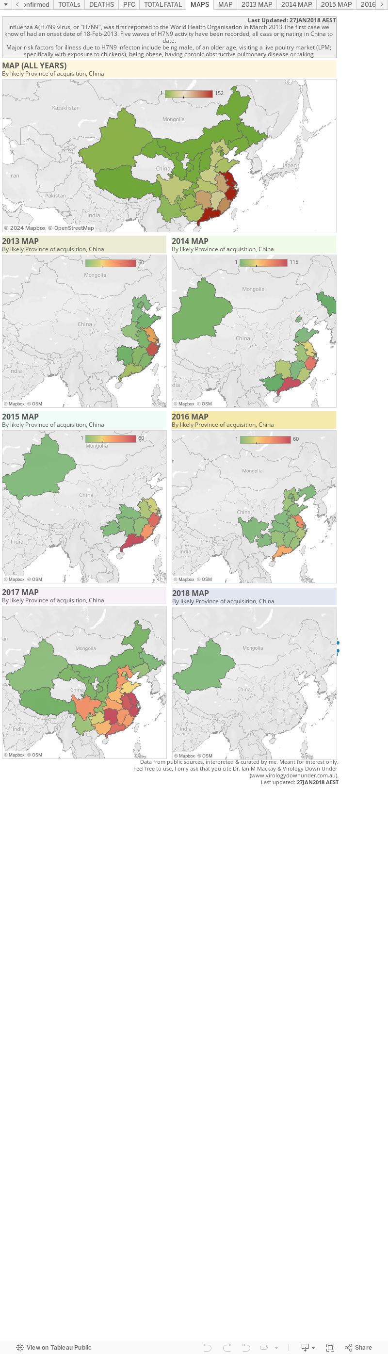
  • Most of the cases in 2015 (bottom maps) were on the east coast of China

Click on map to enlarge
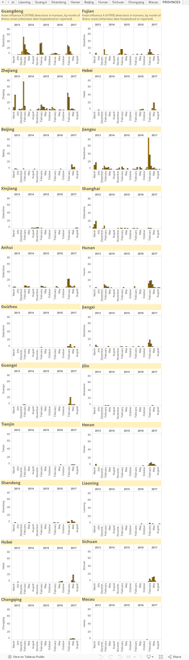
  • Most of the activity in the 3rd outbreak was focussed in Guangdong, Fujian and Zhejiang provinces (the red ones above) 
  • Xinjiang Uyghur Autonomous region (in the far west) and Guizhou and Hubei provinces joined the list of host regions in Outbreak #3
  • Xinjiang joined Guangxi and Jilin provinces (which reporting cases in Outbreak #2) as regions of China that share a border with another country - heralding the movement of this H7N9 variant beyond China's borders possibly into Vietnam, North Korea, or a -stan
Click on graphs to enlarge.
Keep an eye out for H7N9 Outbreak #4 - coming to a colder China around November 2015. 

But for now, it might be time to hit the FluTrackers line lists (okay, I've had 4 tabs open for ages) and graph the course of another source of concern - H5N1 cases in humans.

Hubei province listed its first H7N9 case in April...some rare detail

A new province was recently added to the list of those reporting cases of avian influenza A(H7N9) virus infection in humans. 

Of course reporting does not mean capturing. Reporting has been weak this season. The cases that have shown seem to be just those who were ill enough to visit a Doctor/hospital and get a laboratory test. This is the same story for most infectious agents. We see just the tip of the iceberg, the beginning, the head of the arrow, we only scratch the surface, the glycoprotein on the envelope of the virus as it leaves the...okay, you get the picture.

This year has seen a very disappointing effort by China to provide useful public data that could permit tracking of what has become the annual outbreak of human cases of avian influenza A(H7N9) virus infection.

The human H7N9 case hotzone, at least since we heard about the virus infecting a human in February of 2013, have been on the east coast of China. We currently stand at 659 reported human cases, and over 200 deaths. Very. Roughly.

Click on image to enlarge.

I remember fondly a time when there were scads of data on H7N9-related human cases and deaths. Okay, China did over-share on a number of occasions....

Click on image to enlarge.
Story to be found here.
Click on image to enlarge. 
Story to be found here.
Click on image to enlarge. 
Story to be found here.

..but things have changed. 

For a comparison take the Kingdom of Saudi Arabia's Ministry of Health and their efforts to provide public data on Middle East respiratory syndrome (MERS) and its coronavirus (MERS-CoV). While there are a few gaping holes in the data set (c'mon guys-fill these in!), there can be as many typos as on this blog (but I'm not a public health Ministry - in case you were wondering) and the data can be intermittent, it represents the best public source of detailed, yet deidentified, human data on an ongoing zoonotic viral emergence. And that's saying something. But congratulations nonetheless!

I'm not including Ebola virus disease data-gathering here - the fact that we have had so much data - despite the initial lack of infrastructure and people trained to collect, collate and report that detail - is a fantastic testament to the efforts of those on the ground in Guinea, Sierra Leone and Liberia.

But this season H7N9 data that have been reported by public health sources have been released in blocks and lack any consistent or useful detail, except the province. Some detail is available when harvested from media reports by the ever assembled FluTrackers team. I rely heavily on their line list (to be found here). 

One example of the poor data quality this season, take a look at this text from a recent Disease Outbreak News provided by BigBlue (that's the World Health Organization, or WHO, for those not accustomed to my street groove)... 


No-one will be reading that and feel overly informed.

One is left to assume that this is how these data are coming out of China - infrequently and without detail. We regularly see that when better data are provided - and again, I hold up MERS-CoV case descriptions here - they get publicly listed by BigBlue. 

And before you head to your keyboard to ask "Why should we have access to these data?"...I will first ask you - why shouldn't we? They are collected and collated internally. They are of interest to epidemiologists, model builders, public health planners and data tinkerers the world over. And it's not as though the details are subsequently released in peer-reviewed publications. They are not. 

It's just disappointing.

Editor's Note #22: Two years old today..

On March 27 2013, around the time of Easter and the school holidays, I gave in to the urgings of my wife, to try this blogging thing. 

And today it's two years later and now very clear to me that writing for fun, but based around what I know in science, will be something I do for many years to come. 

At times it's been tough - or maybe other pressures made it feel tougher than it was - and I've considered stopping and have at times paused. As hard as it was though, I found myself wanting to chime in on stuff and could not stay away. I still find that weird, but it must have been a part of me all along - I just hadn't noticed it until after I turned 40'ish. I'm a bit slow sometimes. 

Turns out that I enjoy writing and I needed a hobby that I enjoy and that helped inform and generated such unexpected positive feedback. Everyone needs that I think. Bit of a shame that the typos don't get fewer but such is life. 

It also turns out that blogging made me resign from my job of 23 years - which just so happens to co-occur with this very date. No, of course my resignation was not for such a simplistic reason, but blogging was one of a few major factors that set the process in motion. In particular, blogging about outbreaks of Middle East respiratory syndrome coronavirus (MERS-CoV), avian influenza A(H7N9) virus and the Ebola virus disease epidemic in West Africa. It was that last one that really had the greatest impact on me though. 

From blogging has come more interactions with the media (something I am now a firm believer in more scientists needing to do-communicate what we do to our stakeholders), new collaborations, papers, strange discussions with affiliate Institutes about why they'd rather me not link them in print or press to this press or these papers since I had no research funding for these viruses, friendly discussions with very high ranking Health officials, advice to documentary makers and then an invited role helping out my State's public health team. That one was the kicker. The feeling that the virology information and patterns I'd spent years accruing and piecing together in my head, and now blogging about and drawing graphs and graphics to describe, could be used for the greater good completely ruined me. But in a good way. It triggered many realisations about my current role, some were familiar to me as I had been living with them daily for years, others I had felt in the corners of my mind but they were too intangible and just wouldn't coalesce into anything that would describe itself to me and yet others that were patterns I simply didn't see. Told you I was a bit slow sometimes.

You could of course dismiss all of this as the rantings of a failed scientist who - despite an h-index of 32, 80 papers (15 with >100 citations), >400 citations per year for the past 9 years, 14 book chapters, roles as an Associate Editor at the Journal of Clinical Virology, a Section Editor at Biomolecular Detection and Quantification and an Editorial board for Viruses as well as having continuous competitive research grant funding since he was awarded his PhD in 2003 until 2014 - had missed out on achieving most of his recent grant applications. Go right ahead.

I wanted to use what I'd learned for the greater good. Yeah - as a comic nerd that makes even me cringe a little. But that's where I've been heading, knowingly or not, for some years now. Well, soon I'll be a part of a team that cam help me to do that. 

So I wish you a Happy 2nd birthday little VDU. You've helped me to grow and to learn at the rate of a human two year old. And in doing so, I've met and made friends with a lot of great people around the world. For such tiny things, viruses can have such an impact on us. Quite the hobby.

Avian influenza H7N9 human infection emerged 2 years ago...

Seems like only 365 days ago I wrote about H7N9 being 1 year old.

Now - it's another year later.

While we have studied, written, read and learned much, much more about this emerging respiratory virus than we have about the Middle East respiratory syndrome coronavirus - even after its 3 years among us - we are still watching a new outbreak of human H7N9 cases spread across China. 

Each year more provinces are added to the list to report human infections - more infections likely go unnoticed, unrecorded and/or unreported. Gaps in the reporting is not unexpected and not unusual. 

Each outbreak with its accompanying economic damage, financial losses, human illness and death is because of the desire to maintain a tradition, namely the consumption of freshly extinguished poultry.

We're really good at getting ourselves into pickles. And we seem to be doomed to repeat the patterns, playing catchup and never getting in front of our new and emerging infectious diseases problems. And each time we seem amazed at what we learn, but really, we learn the same thing over, and over and over again. Eventually we'll run out of infectious threats I guess. 

Or they'll run out of hosts in which to incubate in and spread from.

Happy Lunar New Year.

Guangdong sees sense among the feathers...

Guangdong province in southern China is suspending its poultry markets. All of them. From 15-Feb to 28-Feb.[1] While the closures are only for 2-weeks, this will be very important for stopping human cases of avian influenza, particularity of the H7N9 subtype, during the bustling spring period in China. 

Live poultry market closures also remove a traditional dish of fresh cooked chicken. One can be certain that no-one will die because of the substitution of frozen or factory prepared chicken for a fresh chicken, even if chefs don't succumb to the tantrums of last year and refuse to prepare dishes made from anything but fresh market-selected poultry. One can be equally certain that if the markets remain operating during the peak season for influenza virus circulation as they have been, that human infections, and deaths, due to H7N9 infections, will also continue 


Guangdong province has been a major
source of human H7N9 cases in 2015.
Some restrictions were put in place back in December 2014 [2], but that did not stop human cases of infection or deaths.

Why does this closure in Guangdong matter? 

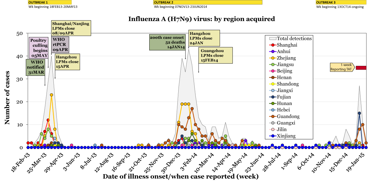
Guangdong province has been a major source of human H7N9 cases this year, as it was in 2014. If we look at the activity under the outbreak curves, we can see the brown line of Guangdong cases has been prominent in both years, only brought under control last year after the closure of the poultry markets...although their temporary closure may have been the reason for the long tail on Outbreak #2's epidemic curve compared to Outbreak #1. Will that tailing happen again in 2015 because Guangdong's markets are only being closed for a short period? Time will tell. 

Occurring at a similar time is the change in seasons. Seasonal change towards summer, makes the survival of influenza viruses in the environment more difficult. It's hard to tease out any one main cause of the precipitous case decline; the market closures or the seasons changing or both. Because most H7N9 human cases have exposure to poultry listed among their details when they are passed along and posted by the World Health Organization, live poultry markets clearly are one major factor for human acquisition of infection. There is literature that agrees.[3,4,5]


The activity under the epidemic curves for each of the three outbreaks. Guangdong province-acquired human cases are indicated by the brown line and features in 2014 and 2015.
Having these markets close is a great achievement for stopping these unnecessary and preventable infections and deaths die to H7N9. Its a big step, a sacrifice and its social change in action. But shutting them permanently would be better.

References...

  1. http://news.xinhuanet.com/english/china/2014-02/15/c_126138118.htm
  2. http://www.thepoultrysite.com/poultrynews/33938/guangdong-restricts-poultry-markets-over-bird-flu-fears
  3. http://www.ncbi.nlm.nih.gov/pubmed/25340354
  4. http://wwwnc.cdc.gov/eid/article/20/12/14-0765_article
  5. http://jvi.asm.org/content/88/6/3423.long

Societal change and H7N9..

The importance of societal change for controlling infectious disease outbreaks really cannot be over-stated. 

For Ebola virus disease, it came down to stopping the tradition of direct contact with the body of those who have died and dircet contact in general. For MERS it
seems that occasional camel contact triggers insertion of the MERS-CoV virus into hospitals where lax infection prevention and control practices add to the case load. 

For influenza A(H7N9) virus cases, it is the habit of obtaining live poultry from retail markets where rare virus-laden chooks are culled and handed over because of a desire to see, choose and purchase the tastiest fresh chicken. 

There is a common thread among these stories about direct contact or inefficiently droplet-transmitting virus infections: we can stop their spread. 

But we also amplify and prolong their spread. 

However, when it comes to human-adapted, efficient droplet-spread or airborne-transmitted viruses - well, then we're in trouble. Of course we could all just lock ourselves in a room for a few weeks but that won't ever happen.

So its very important to head off these "emerging" viruses while we still have a modicum of control over them. Once they get away from that control, and theoretically that could happen in the blink of an eye-right now even-no amount of fancy infra red cameras, poorly donned surgical masks or fancy hospitals laden with machines that blink and go ping, will stop them from spreading globally.

Cheery.

In the meantime - here's hoping China speeds up the closure of those live poultry markets. Habits can be changed but death is forever.

Click on image to enlarge.

H7N9 outbreak #3 underway?

What better way to start 2015 than a snapdate!! For those who are new to them here on VDU, they were initiated here and defined here as snap updates - posts that don't have lots of detail and chat...although they almost always end up having lots of chat!

Figure 1. H7N9 cases by week of onset (or hospitalisation
or reporting dates of the preferred onset date was
not made public).
Click on image to enlarge.
This one is an update of the situation of one of the many avian influenza viruses ("bird flus" if you must) around again - avian influenza A(H7N9) virus, or just 'H7N9'.

In Figure 1, I've taken the huge liberty of adding in the start and end dates of the 3 outbreaks of H7N9 to date; and in doing so, I've said that China is in the early stages of one right now. I may well be wrong of course - this is a blog and these are my opinions - but it looks that way to me. 

Figure 2. China's northern laboratory network influenza
surveillance data up to Week 51 of 2014. [1].
Click on image to enlarge.
The case numbers for H7N9 in Figure 1 have been above zero for a little while and in particular November looked like a busy month (see weekly and monthly tallies here). Keep in mind that there is also a reporting lag - the time between date of onset (obtained from more detailed World Health Organization data) and the date the case was publicly reported (I rely on FluTrackers line list for these details). That delay can be a month or more on occasion; up to 38-days in late December. I suspect this is because China reports cases to the WHO in batches, something instigated toward the end of the 1st and 2nd outbreaks. So I suspect we will see more cases assigned to December, during reports that come out in January.

But it look like 'tis the season for influenza in humans in China (see figure 2 and the Chinese National Influenza Centre [2]) - and as some of us have discussed on Twitter, this is most probably due to the changes in weather (environmental conditions) which result in sustained viral survival on cough and sneeze-contaminated surfaces and in wet and dry propelled droplets and droplet nuclei; in both man and bird (see Hong Kong avian influenza detection report dates [3]). 

That sustained survival may well be all it takes for more of us to pick up an infectious viral dose.

Once the seasonal influenza viruses get a foothold in us, they spread well, causing disease in those who are susceptible and probably a bunch of unnoticed infections in those with previous exposure to that strain plus a healthy immune memory of that intrusion. By "seasonal influenza virus, I mean those that replicate in and circulate efficiently among humans, as opposed to the relatively inefficient avian subtypes.

So stay tuned to H7N9; it's not yet very good at spreading between humans but its established in birds and has been spilling over into humans since at least the beginning of 2013. We know how influenza can deal us a rough hand if the stars and its genetic segments align favourably (for it). Oh, and the continued reliance on fresh chicken obtained from and killed at live poultry markets. The majority of cases have very clearly had contact with poultry as defined by the WHO. 

References...

  1. http://www.cnic.org.cn/eng/show.php?contentid=738
  2. http://www.cnic.org.cn/eng/surveillance.php
  3. http://www.chp.gov.hk/files/pdf/global_statistics_avian_influenza_e.pdf

Influenza A(H7N9) virus: detection numbers and graphs...

This is a static page that will house my graphs of influenza A(H7N9) virus ("H7N9) numbers produced by the various Ministries of Health for the provinces and municipalities of China, the World Health Organization and FluTrackers.

They may take me a little while to get back up-to-date in this new format so stay with me. I will Tweet each update as I do for MERS-CoV and Ebola virus updates.

There is also an accompanying map page which for now is located here.


Reminders: 
  • The graphs above, as with all on VDU, are made for general interest only. They are also freely available for anyone's use, just cite the page and me please. The data can be downloaded by clicking on the "Download" link at the bottom-right of each dashboard. It may be that I have misinterpreted the language in the reports (sometimes a little tricky to wade through) or miscalculated some totals based on the way data have been presented.
  • In any outbreak, epidemic or pandemic caused by a know or emerging pathogen, the numbers presented publicly, and used in these graphs, are expected to represent only a fraction of all the cases that have and are occurring. This is just the nature of the imperfect biological'ness of these events.
  • I am only able to plot what is publicly available-you could do this too. No secret associations or back-room deals provide me with these data.

How to read a VDU graph...

I'm a pretty simple guy. So the stuff that I put onto Virology Down Under's (VDU) blog is usually something I think can be understood by you - my yard stick is that if I can understand it, then I think you can. Sometimes it can get pretty technical though and with things always done in a rush, I don't stop and explain as much as I could. Which is why I value feedback. And I've had some good stuff from @DeclanButlerNat, @JorgeCastillaE and @Moro_Cedric this week. 

Different levels of experience read this blog and my posts on Twitter, so sometimes I direct my graphs towards them. But I do understand that we scientists can be easily carried away by our interests and forget that we're quite used to interpreting our own presentation styles in a certain and speedy way. We've had lots of experience doing it that way. I can change a tyre (as I was reminded a couple of nights ago, at midnight) but I couldn't fix my engine.

At the heart of reading a graph is this fact: you have to look at the axes to understand what the lines or bars or areas mean. Once you know the style, you can understand it at a glance - but first time, examine it with care. If it's one of mine, feel free to ask me what I'm trying to show if it is not immediately obvious. I very well may have failed to make it clear.

So this is a little overview of how to read some of the graphs which I use to communicate what I consider to be otherwise yawn-inducing tables of numbers about viral infection and disease numbers.

A picture is worth a thousand words..

This is a good thing because with my lack of typing skills, if I had to type 1,000 word all the time, that would be at least 200 typos. Graphs plot those tabular numbers in a more colourful and visual way. Once you know how to read a graph, they can become powerful and quick ways to get a quick update on the state of play. On VDU the game seems to be about outbreak data. That's just the way things have evolved for me since I first blogged on 28-March 2013. This includes graphing the number of people with disease (cases), changes in the number of cases, numbers that are suspected versus the number that are actually laboratory confirmed (my currency), dates of onset illness (favoured piece of data and the hardest to come by publicly), the numbers who die, the proportion (%) of all cases/detections who die, dates when disease was reported, sex, age and all of that can be plotted on graphs by day, week, month or year.

Interpreting a basic graph on VDU...

The graph below (Graph 1) comes from following Middle East respiratory syndrome (MERS) public data. It shows the key parts of the structure of the graphs - the axes (the horizontal and vertical lines that are the key to reading the plotted numbers) and the axes.

  • A basic graph has a bottom horizontal line called the x-axis and it has a vertical line on the side called the y-axis. These are used to tell you what the numbers plotted on the graph mean; they are a key to the placement of each point on a graph, according to at least 2 different values.
  • Each point on a graph represents a coordinate. Its made up of an x-axis values (abscissa) and a y-axis value (ordinate). For example we plot 50 cases reported on Thursday or 50 on the y-axis and Thursday one the x-axis (x,y)
  • The points that we plot as pairs of x and y data can be joined up and shown as a line (the area underneath the line can also be coloured in which looks like a mountain that may have peaks and troughs) or they can be plotted as bars. There are other ways too - but I keep it simple. Joining up these dots is not always accurate - we may have no idea what is really happening to the numbers between any 2 points, in that case a bar graph may be more realistic as it shows the numbers at a distinct point in time. Sometimes bar graphs don't work from a formatting perspective (eg bars get so skinny you can't see them). Other times, joining the dots reveals the trends (the general direction that events are heading even if we don't know the values). Trends are useful in infectious disease as they show what has happened and what the latest data mean in the context of what has come before - so not too unrealistic. Some of this is about being accurate while not being too overly obsessive.

The particular example graph I've included below (Graph 1)  is a little trickier than some because it has 2 y-axes (vertical lines) - a primary (left-hand side) and a secondary (right-hand side). Some of the numbers are plotted against the primary y-axis (left vertical line) and some against the secondary y-axis (the right hand vertical line). This lets me "double-dip" on shared x-axis numbers, in this case, dates. I'm graphing the course of 2 different things (number of actual cases by day of illness onset) and the number of reported detected by date. These are 2 different things that have dates in common. 

This graph lets us compare, using the same x-axis, what the MERS case numbers look like when they are plotted by the day the people were reported to have become ill compared to the date of public reporting of the cases. There are differences that become more clear when you can run the 2 lines on the same graph, that may be a bit harder to see when they are plotted on 2 separate graphs. This graph highlights that when cases become ill and when they are reported are different things. It also shows that there were a bunch of cases (113) reported in 1 day that have never been given dates of illness onset (or hospitalization or the date they were each reported to the Ministry of Health). It also makes use of the 2 y-axes to have different scales. The primary or left-hand y-axis goes up to 35 while the secondary or right-hand y-axis maxes out at 120. If the same axis values were used, the illness onset cases would mostly be hard to see.


Graph 1. The basics of a graph.
What about cumulative graphs? What are they and how do I interpret those?

The next graph is made to show cases piling up over time (Graph 2). This is the graph that sparked this blog. It plots numbers as a line graph but instead of showing the value at that timepoint (day, week, month, year), it adds the new number to sum of all the previous numbers. It is plotting a cumulative tally, so it will always be a hill with an upwards (left-to-right, bottom to top) slope except when there are no new cases to add, when the curve becomes parallel to the x-axis - a flat line. How steep that line is can tells us how rapidly cases are piling up. That can also be fudged if you present the chart with a very short or long x-axis.

  • In the case of the Zaire ebolavirus outbreak in West Africa, we have the unusual ability to compare numbers from multiple countries at the same time, and use the same x-axis. Here, we show the date when the World Health Organization's Disease Outbreak News update was released. Sadly for us graph addicts, this doesn't include any illness onset dates, but the WHO do have those data and plot it themselves here (1).
  • A steep slope indicates a rapid rise in cases and this results from a lot of new cases being added in a short period of time.
  • A near flat or horizontal slope to the line shows that there are not many new cases being added. 
  • In this graph we also show multiple lines plotted using the primary (left) x-axis to present how much and at what rate the total suspect, probable and laboratory confirmed case numbers are piling up (pink) as well as how the deaths from among that number are changing (blue line) and how many of the cases are being laboratory confirmed (green line) as due to the virus suspected of being the cause. This last one is important as it gives a glimpse of how the laboratory network is coping, perhaps how specimen access is going and how much faith to put in the other two totals. Why are we worried about the result totals? Because many other things can look like Ebola virus disease (EVD) early on, and even later in the disease course. A laboratory test is the only way to be certain that the patient had that virus.
  • Nigeria's numbers look to be rising alarmingly fast. Relative to each other they are, but compared to the dozens of new EVD cases being added between reports in other countries, it is still a small (although still very bad for Nigeria!) increase. This highlights that care is needed when reading charts. Perhaps also an understanding that between different outbreaks, the rate of new cases being added is disease specific. Lots of influenzavirus detections during flu season is what we expect, any ebolavirus cases are not what we expect nor what we want to see. Context. A hard thing to account for and probably a matter of experience.
Graph 2. The cumulative case graph. Adding new numbers to the sum of all the numbers that came before. 
Click on image to enlarge.

Graph 3. Changing the scale. Raising the primary y-axis (left) scale to 750, the level of the other country graphs, makes Nigeria's case numbers look tiny. But it underestimates the impact of the localised spread of Zaire ebolavirus in an are that was not part of the outbreak until a case flew in and spread it. Changing the scale is not just whimsical decision making, it can highlight the importance of events that may otherwise go unnoticed.
Click on image to enlarge.

Take care when interpreting a graph - look at the axes and also use your noodle

Finally, I'm going to look at the way in which I present the numbers I plot on a graph. I'm using the cumulative case chart for Liberia as my example (Graph 4 collection). Its the same one used in Graph 3 - the only thing different is that I've dragged the x-axis to the left (shrunk) or to the right (stretched) to see what that does. 
  • The line plots look more or less steep when you shrink or stretch the x-axis, respectively. But the numbers have not changed. Possibly, our interpretation of them has, as a result of seeing the slope change. Remember though, check the axes. If you look at the x-axis, the shrunken version shows that those cases have climbed over a longer period than the slope suggests. Always check the denominator (the y of x/y) when you think about slope. Equally, the flatter curves of the stretched out x-axis, at the bottom of the Graph 4 collection, have to be looked at in context with time. The dates have been dragged out to what may be an unreasonable length, which makes the slopes look less; but they are still steeper in July than they were in April. Look around the graph for comparison. 
  • As I said above, the current multi-country outbreak lets us compare and so we can see that some areas are adding new cases very rapidly between each report (Liberia and Sierra Leone) while others (Guinea) are not adding as many as quickly. Nigeria looks to have jumped quickly but that is also because of the altered scale (discussed above) 
  • On VDU I get around this by also adding charts that plot total numbers per day or week or month or year. This shows a more discrete series of data that grow or shrink as the outbreak peaks or resolves. The 2 peaks of influenza A(H7N9) virus outbreaks illustrate this nicely - especially when combined with a cumulative case chart (Graph 5)!
  • There is no real right or wrong here (although there are pixel width constraints)- but don't let your perceptions fool you when looking at someone's graphs for the first time. Take some time to really look at the graphs.
Graph 4 collection. Stretching the x-axis can seem like stretching the truth. But carefully read the axes. Some experience is needed here and ultimately you are at the mercy of the person presenting the data.
Click on image to enlarge.


Graph 5. Influenza A(H7N9) virus outbreak in China during 2013 and 2014. Plotting the numbers discretely (by week) clearly shows the two outbreak peaks (darker blue lines joining the data point dots) and gives valuable context to the cumulative graph in the background (pale blue mountain). This is probably my favourite style of disease numbers graph.
Click on image to enlarge.
I hope that has helped make sense of my graphs, and perhaps those of others too. I'm always on Twitter so hit me up with questions about this or requests for more posts like this, or to tell me whether it was helpful.

References

  1. http://www.who.int/csr/disease/ebola/EVD_WestAfrica_WHO_RiskAssessment_20140624.pdf?ua=1


Now for something (not so) completely different: H7N9 maps...

Now it's time to mess around with influenza A(H7N9) virus mapping using Tableau.

I've (only just) realised the my esteemed peer, Shane Granger has been using Tableau to do this for ages (see here), and that this will be duplicating his excellent work. So I'll try my best to consciously differentiate my maps from his - but there's only so far you can go with that and there will be overlap. 

The page below is a very early first play with H7N9. It's just detections broken across 2013 and 2014, by province most likely to have been the source of the infections (as far as I can tell) in mainland China. 

If I can master this I'll try and add more details in the future. For now, these numbers a a little out of date but he trends are similar. This charts 449/452 detections.


Snapdate: Avian influenza A(H7N9) virus...

There seem to have been more announcements of late than previously so I thought I'd plot this and see. 

These are a little adrift as the last 7 or so have not been through the WHO scrubbing process (which adds extra bits of data) so we will see a little shifting the last 2 or so blue dots on the chart below.
Click on image to enlarge.

Guangdong and Anhui provinces have the most active case generators in May.

Anhui province has reported 3 cases in a week and there seem to have been a constant stream of cases in May, but they they don't, in reality, seem to be out of what's become the ordinary in 2014 for a virus that is happily ticking over in several provinces.


Avian influenza A(H7N9) virus found in more than half of wet markets in Guangdong...

It comes as no surprise to me, but is still a very welcome piece of data, that Guangzhou's ongoing live bird markets and concurrent continued cases of H7N9 in people, are also happening in a an environment of 60% of market stalls tested positive for the virus in April.

A report in the South China Morning Post noted 
"Upon conclusion of the trial on September 30, the city government proposes gradually extending the ban, covering chickens, ducks, geese and pigeons, to other parts of the metropolis. The ban is expected to be implemented citywide by 2024."

"Currently, it affects 298 live poultry stalls at 82 wet markets in Yuexiu district, and in parts of Tianhe, Liwan and Panyu districts, where vendors will sell centrally slaughtered chickens that will be provided by three designated suppliers."
This is welcome news and a positive step towards stopping not just H7N9, but a raft of other influenza viruses that jump to us from, and mix to create new virus within, birds.

Source...
  1. http://www.scmp.com/news/china/article/1505389/guangzhou-begins-trial-ban-live-poultry

H5N1 versus H7N9...

Green bars include surviving and fatal H5N1 laboratory-
confirmed cases in humans. The green "mountain" (area 
under the curve) is the accumulating tally of total cases. 
The red area-under-the-curve is the accumulating tally of 
fatal cases. The current total H7N9 cases is shown as a 
horizontal dashed blue line.
Click on image to enlarge.

This remains a kind of a pointless exercise. As I noted when I posted this first time back in February, but since I'm preparing some lectures I thought I'd post the latest version anyway.

These avian influenza A(H5N1) virus numbers have been curated since 2003 when the World Health Organization started an official tally. To that chart I've added where the current total number of laboratory confirmed human cases of infection by avian influenza A(H7N9) virus sits on the accumulating case tally (the green area-under-the-curve line). This blue dashed line highlights what we've heard before; H7N9 cases are piling up faster than H5N1 cases did. 

From 2003 it took H5N1 human cases nearly 6-years to reach the 430'ish mark; it's taken H7N9 about 61 weeks.

Sources...

  1. Monthly risk assessment summary |  Influenza at the Human-Animal Interface
    http://www.who.int/influenza/human_animal_interface/HAI_Risk_Assessment/en/

H7N9 Snapdate: some quick charts...

Click on image to enlarge.
I don't have a lot of time tonight so this is just a quick post of some updated charts with a few summaries of some key features of the influenza A(H7N9) virus situation in south-eastern China. At writing it was at 432 detections with media reporting 128 deaths

Click on image to enlarge.
Guangdong is where H7N9 is still most active and it is this province that is the source of the continued cases trickling off Wave 2's peak.

Most H7N9 cases overall have been in Zhejiang and Guangdong provinces but lately, post-peak of Wave 2, there has been continued activity in Jiangsu province including a recent healthcare worker with no mention of "contact with poultry"; the absence of which stands out in World Health Organisation (WHO) reports because most cases are followed by affirmation of that phrase.

Click on image to enlarge.

In  the  survival chart above we see that most of the fatal cases, shown in red, are defined by an older age. Unfortunately, a lot more of the fatalities have been reported through the media without identifying details (48 of 128), than have come through official Chinese channels and out via the WHO. This lack of detail makes it impossible to clearly link a lot of the deaths to the case announcements. Only the custodians of these data know what this chart should really look like. NB: Since making the chart this morning I've found a handful more case details at FluTrackers, but public detail on fatal cases remains the weakest of any of the H7N9 data.

Click on image to enlarge.
We can see in the weekly chart on the right that the two H7N9 waves differed in timing, the width of their bases (more cases in Wave 2) as well as how "tight" their peaks were. Wave 2 has tailed off, but continues to spit out cases, while Wave 1 comprised both a steep climb and a steep decline in human cases.
Click on image to enlarge.

If we zoom in on Wave 2 we can see by looking at cases per day in the chart on the left, that between 0-4 illness onsets per day are being reported, as they have been since late Feb-2014. 

Is this the legacy of those regions whose live bird markets remained open or were only shut temporarily for disinfecting and restocking? Those regions with markets that were shut for much longer, or for good, do not seem to have contributed much to the continuing leak of H7N9 infections despite being key contributors during the peak periods before markets were closed.

Click on image to enlarge.
In zooming in on Wave 2's cases by week, but this time based on the region of likely acquisition of infection, we see that Guangdong province (brown line) has been the most consistent contributor of human H7N9 infections both late during the 2nd of the Wave 2 peaks, but also after the peak's decline almost everywhere else in south-east China. There was considerable publicised unwillingness from poultry producers to permanently close markets in this Province, a location with a major role in the nations poultry production. And so this little experiment incubates further and I have little doubt we will see the impact of that unwilingness late in 2014. 

Click on image to enlarge.
As noted above, public H7N9 death data do not allow good linkage with official case announcement data for about 48 fatalities, so my second-last chart tonight uses both public and media-release numbers to try and illustrate how the proportion of fatal cases (PFC) has changed across both Waves. The PFC seems to be holding fairly steady now between 17% and 30% (depending on source of numbers).


Click on image to enlarge.
And finally we see that the age and sex distribution across all cases (both Waves) is skewed to wards older males. Same as usual. If we look at this distribution (ran out of time to put in here) for the fatal cases, it is much more tightly grouped around the >60-year olds, but that females appear to dominate males in deaths during Wave 2, whereas it was the other way around for Wave 1.

Like Us

Blog Archive