The Zaire ebolavirus (abbreviated as EBOV) is one of 5 species of ebolavirus and a member of the same viral family as the species Marburg marburgvirus (yeah, I know). Three of the ebolaviruses, EBOV, Bundibugyo ebolavirus (BDBV) and Sudan ebolavirus (SUDV) are associated with Ebola virus disease (EVD) while Reston ebolavirus (RESTV) and Tai Forest ebolavirus (TAFV) are not.
Much has been written this week on why you are perfectly safe from an outbreak of EVD in your (judging by VDU's stats) probably non-West African home town, or while at the fruit shop or on your couch watching the trailer for Guardians of the Galaxy on endless loop while clutching your ticket for tomorrow night (it's reeeal).
A plane may deliver an infected person to your country, but our healthcare system will catch it. It will be contained, kept in its box like a hyperactive yet frustrated boggart. Nothing to see here. Move along please. These assurances come after the preceding week in which we felt the aftermath of the first symptomatic "EVD on a plane" incident, 2 US healthcare workers becoming infected and the death of a very bright light in the treatment of EVD patients in Sierra Leone. Twitter's ebola hashtag has been afire like a stock exchange ticker ever since 2-weeks ago.
I'm here to say, it's okay to freak out as much as you like...just don't run into traffic, sell the kids or move to an isolated farm and stock up on tinned food. It's not that kinda bat-crazy. (apt)
So what is it about EVD that could warrant you feeling more fearful about it than about other fatal infections that are far more common?
Don't forget >14,000 deaths due to Clostridium difficile infections per year (1), 200,000 people die of cholera each year (2), >600,000 died of malaria in 2012 (3) and >1,000,000 died from an AIDS-related illness in 2012 (4). Big numbers. How does our fear remain in the face of that tide of microbial mortality?
Could our unreasonable fears be due to any of these?:- Most diseases on that list are (still) treatable. HIV not so much, and antimicrobial resistance is of course on the rapid rise. Yet EVD kills more than 1 person in 2 and it does so quickly. That's scary. It isn't treatable; although that could be changing if the ZMapp "plantibody" and its pipeline comrades ever get to decent controlled trials.
- Perhaps you just don't fee like you will get cholera or AIDS. They are "somebody else" problems but this jungle virus, well that's all over the TV, the papers, the web and on radio. It must be spreading fast.
- This outbreak has spread widely in 3 countries, and cases are being added in numbers above 100 every few days. Now EVD seems to be spreading from that person who travelled on a plane while ill. Healthcare worker contacts seem to be bearing the brunt in this 4th country (Nigeria). OH, and he vomited on one of the planes he took on his multi-stop journey from Liberia to Nigeria.
- EVD is a haemorrhagic fever. Haemorrhagic fever I said - arrggh!! No wonder they changed that name! It just sounds scary.
- Around 40% of cases show obvious signs of bleeding. Not the movie level, leaking-like-a-sieve stuff though. But someone is bleeding. On the outside. For everyone to see. From a virus infection.
- EVD starts off like the flu, or the effects of a dodgy curry but it can end up with you laid out, alone and dying, with only your suited carers for close yet distant comfort.
- Entire families get wiped out during these outbreaks. Perhaps not scary, but heart wrenchingly tragic and something we can feel in our own guts.
- Even experienced healthcare workers get infected by this virus. Sure, this is likely attributable to the hot, overwhelming conditions, to the numbers of cases, under-resourced clinics (by big shiny HEPA-filter equipped hospital standards anyway), tiredness and accidents, but it's happening.
- Just because! Humans watch in fascination the most exotic and scary things. Many like to be scared.
So I think it's okay and even perfectly normal to feel uncomfortable, worried, fearful, perhaps even a bit angry that your country is not doing more to help in West Africa, or is doing so a bit late.Don't add guilt about having those feelings.
But do make sure you reality check yourself and your friends.
Some of the concerns listed above just won't be a problem for you in your neck of the woods. Most of us were probably born into a very different situation to those being ravaged by the Zaire ebolavirus variant, a virus about which little was known by those who live in the region, until very recently. Perhaps that is partly our fault since we have lately been able to show that ebolaviruses are not new there after all (5). But this multi-country outbreak is likely to have started through practices that have been commonplace yet not ever resulted in this sort of death before. Most who will read this do so from a place of relative privilege. You are not likely to see an EVD case in your life. Do what you can to find out the facts. WHO and the CDC have many great webpages of resources that can help teach the realities. Read them.
One reality is very clear, West Africa needs help to shut this down. It should have had it sooner.
Fear is fine, but remember your reality.References..- http://blogs.scientificamerican.com/molecules-to-medicine/2014/08/05/ebola-and-priorities-in-drug-development/ (from http://blogs.scientificamerican.com/molecules-to-medicine/2014/08/05/ebola-and-priorities-in-drug-development/)
- http://www.who.int/mediacentre/factsheets/fs107/en/
- http://www.who.int/mediacentre/factsheets/fs094/en/
- http://www.who.int/gho/hiv/en/
- http://wwwnc.cdc.gov/eid/article/20/7/13-1265_article
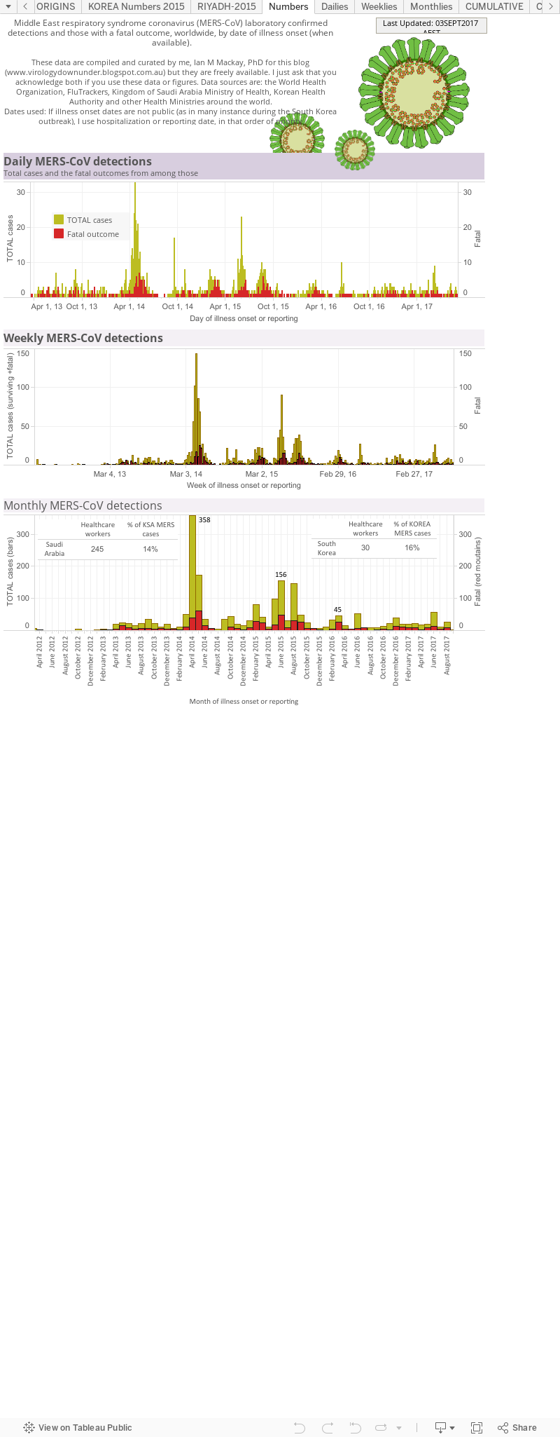
This is a static page - the internet address won't change, just the charts as I add new numbers and update them. The page will follow Middle East respiratory syndrome coronavirus (MERS-CoV) detections by day, month and the cumulative tallies, worldwide and focus on subset of the numbers that are public available. That means these graphs are at the mercy of each nation's willingness to provide basic, deidentified (so patients are never publicly identified) information. At a minimum these could include:- a unique case identifier (preferably in collaboration with country where diagnosis was confirmed and used by all)
- age
- sex
- date of illness onset (DOO; when they first became ill; preferred value to use top plot cases along the bottom axis of the graph)
- date of hospitalization (DOH; if no DOO - the I plot using this*)
- date of laboratory confirmation
- town & country of diagnosis
- whether a healthcare worker
- whether underlying disease (comorbidities) were present
- animal contact if a possible or known zoonotic disease
*If no DOO or DOH - then I plot using the date of reporting.Data visualization ("viz") 1.
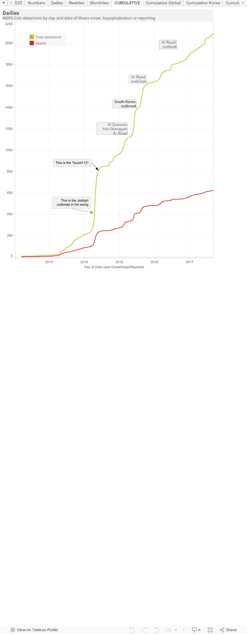
This breaks down the living (yellowish) and dead (red; when they died) people from which MERS-CoV was confirmed by a laboratory, either as viral RNA-positive using RT-PCR or by the detection of an antibody response. The graphs also show the counts as per day, per week and per month to cover a range of different 'ways' of looking at the numbers. In the Monthlies graph, I have nested a Table that shows how many healthcare workers (HCWs) have been infected and that that equates to as a proportion (%) of all detections from that country.Data viz 2.This is a cumulative curve, It adds the newest case numbers to the total from the timepoint before and so it shows the growth of cases - in this case, of all MERS-CoV detections worldwide. I've marked some pints of interest. These are usually clusters or outbreak and cause a sudden rise in case numbers, seen as a steep curve; a change in rate of case growth. As the cluster or outbreak resolves, the curve "slows down" which can be seen as it levelling off to a horizontal line.
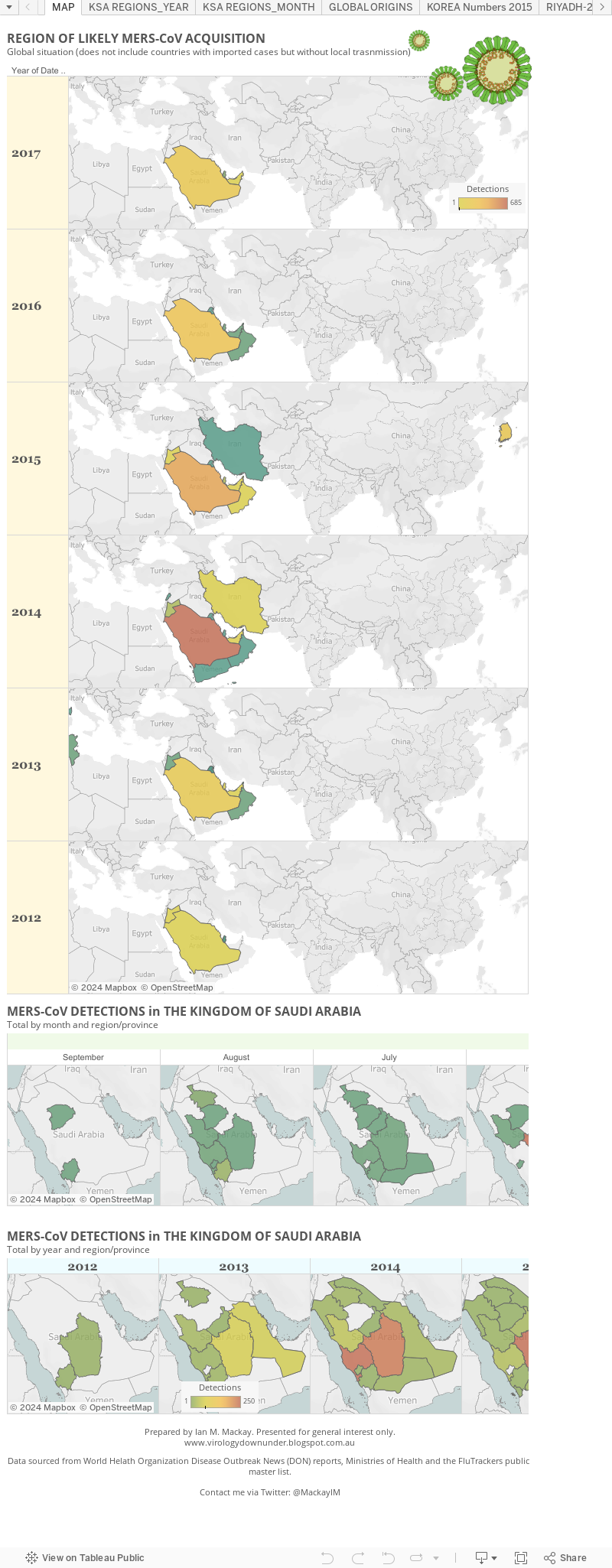
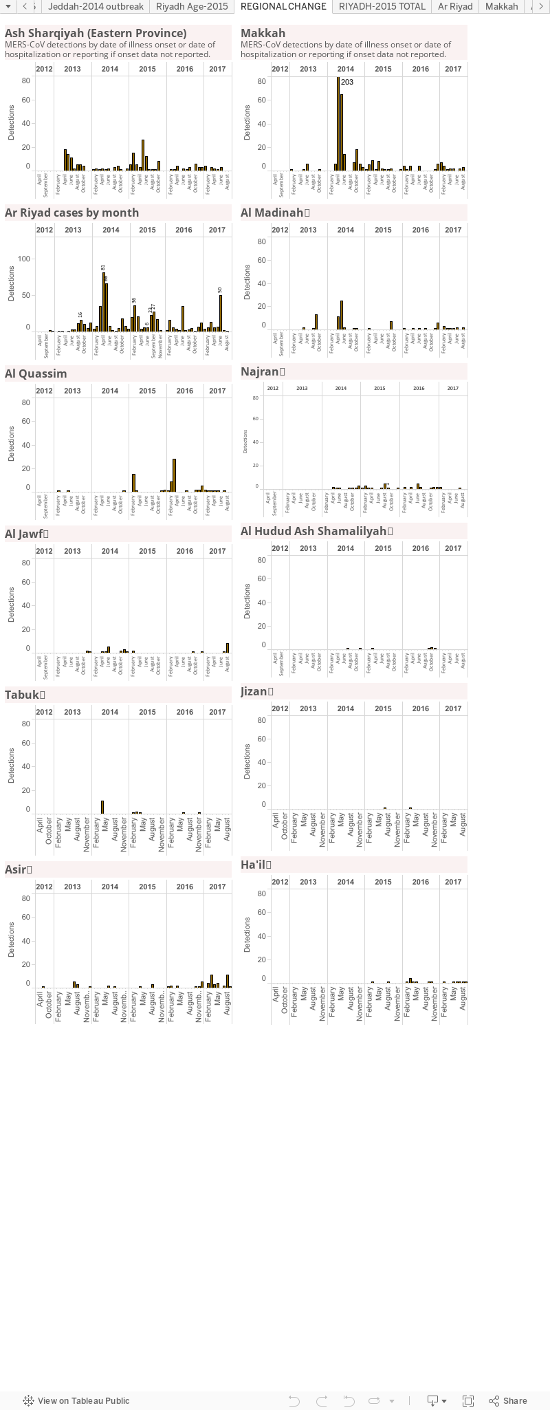
Data viz 3.The maps of MERS. This shows the global situation as it relates to countries in which local spread has occurred. It doesn't show countries that have had a case arrive but from which no secondary cases arose. Below that I focus on the monthly MERS-CoV detection totals in The Kingdom of Saudi Arabia - where most cases have occurred. On this panel you can use the slider to trace the regional case loads back though time. The final graph depicts the Kingdom's case load but by year and region; there is also a slider at the bottom go the graph. Both of these last two graphs use a heatmap approach to highlight the hotzone(s).
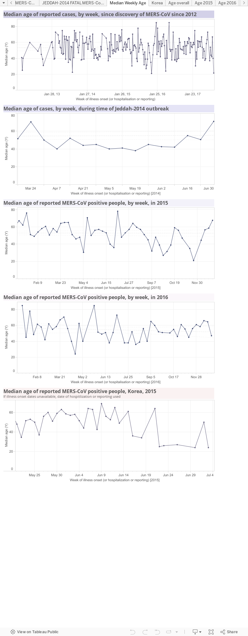
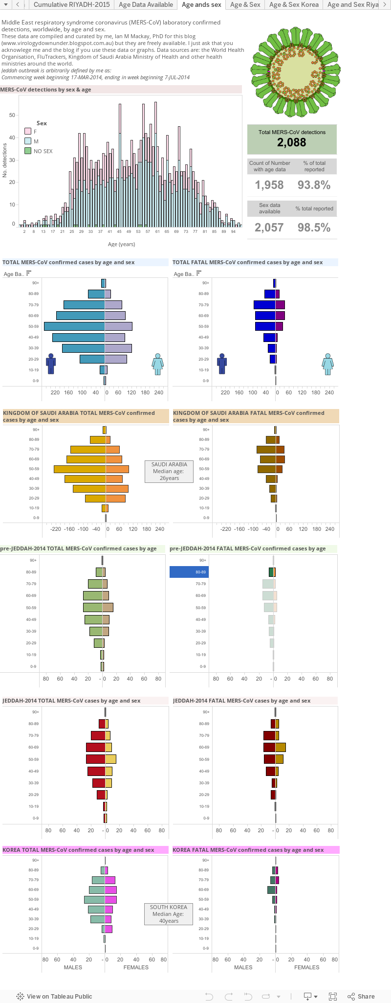
Data viz 4.MERS by age. These four panels show median age over time. The 1st panel follows MERS-CoV since its discovery; the 2nd panel focusses on the period of the largest outbreak, associated with hospitals, in and around Jeddah in 2014; the 3rd panel looks just at 2015; the 4th panel looks at the age of cases in the 2015 South Korean hospital outbreak.Data viz 5.MERS by region of the Kingdom of Saudi Arabia. This is another way to track which region or province is the hottest spot. It does not account for the creation of "MERS-specific clinics or hospitals to which cases from other regions may be being transported.
Data viz 6.MERS by age and sex. This includes a table of the current global total number of MERS-CoV detections and highlights the gaps in my line list of age and sex data. There is a global age and sex bar graph (male-blue;female-pink-sorry; green-no sex data). Next are age/sex pyramids for the world, the Kingdom of Saudi Arabia, pre-Jeddah and then the Jeddah and South Korea hospital outbreaks.These graphs highlight the different distributions during times of sporadic cases or times of clear outbreaks. They also highlight that more cases are male and show some difference between cases and fatal cases as well as differences between Saudi Arabia and an outbreak in another country-highlighting how important the health of the community is to the impact of the same virus.
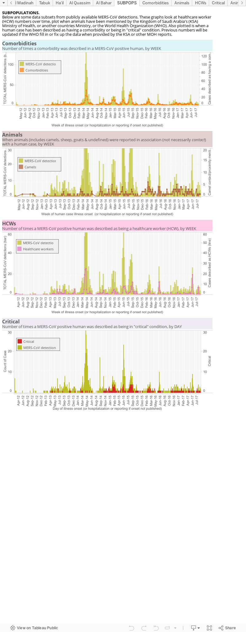
Data viz 7.This is an odes and end viz of some subpopulations. 1st there is a panel looking at the number of comorbidities over time (orange line) against the total case numbers (pale brown mountain), globally; 2nd is the number of times an animal (brown), or specifically a camel (yellow), is mentioned alongside a case; 3rd is a plot of the cases identified as having a role in healthcare, again against a backdrop of the total MERS cases worldwide. This lets us see increased spillovers and, usually with hindsight, associate them in time with a spike in cases. It also shows the intimate relationship between MERS and the healthcare environment as healthcare worker numbers spike along with an overall rise in cases.
Data are derived from the World Health Organization, FluTrackers and various Ministries of Health.
The chart above, as with all on VDU, is made for general interest only. It is also freely available for anyone's use, just cite the page and me please.