Medical News Blog Information

MERS-CoV snapdate: detections by most likely region of acquisition...

Click on image to enalerge.
Just a quick check. 

Yup. 

MERS-CoV detections still rising in a linear and steep manner.

But we are nearly at the end of Week 111, and it has so far yielded (dates still to be finalised and largely based on dates reported) 42 detections compared to Week 110's 102 MERS-CoV detections. Things may well have started to slow down.


MERS in the USA....

The source of all exported MERS-CoV positive people lies within the Arabian peninsula. Very limited local spread has occurred within 3 non-peninsula countries.
Click on image to enlarge.

The Middle East respiratory syndrome coronavirus (MERS-CoV) made its way to another country yesterday; the United States of America (USA).


MERS-CoV in the KSA during April.
Filled red circles mark towns and cities for general interest.
The darker sandy coloured areas indicate KSA Regions
(also Egypt and the United Arab EMirates) where
MERS-CoV detections have been located recently.
Click on image to enlarge.
This is not a big surprise and it's not the end of days, but dude...it lit up Twitter and had reporters high-five'ing like nothing the 460 cases before it, mostly around the Arabian peninsula, managed to achieve. But then MERS-CoV detections have only been accruing for 111 weeks. 

These things can take time to warm up.

The USA case was in a healthcare worker (HCW) travelling back from the Kingdom of Saudi Arabia (KSA).

What else do we know?

  • FluTrackers #456
  • The HCW who was working in Riyadh, KSA, travelled back from there to Chicago in the USA via a transfer at Heathrow airport in the United Kingdom, 24-Apr.
  • Illness became more noticeable 27-Apr (coughing, shortness of breath and fever), and the person was hospitalized 28-Apr in Indiana.
    Was less noticeable illness present first? We know little about what the earliest inklings that someone has a MERS-CoV passenger feel/look/sound like.
  • Age and sex of the patient have not been officially released.
    I should stop complaining about that from the KSA Ministry of Health data. Still important to know it, but if its not provided by one high income economy, why expect it to be provided by any other?
  • The laboratory confirmation was made 2-May (~4-days)
Because the person wasn't coughing, sneezing or noticeably wheezing on the planes, it will be unlikely that any virus was propelled towards, or impacted upon surfaces shared by, people nearby. We will of course be watching as the USA health professionals track, observe and hopefully swab and test at least some of the contacts from the planes and post-transit spaces. These people can tell us a lot about what the virus is doing among people not defined as "close" contacts; a kind of live experiment to check if MERS-CoV transmits any differently now than it did the last time it got loose from the Arabian peninsula. On those recent occasions neither Greece, Malaysia nor the Philippines saw any additions to the transmission chain.

I can remember when MERS and H7N9 cases were so rare I used to do a work up like this on each announcement. Ahh the good old (slow) days.

Sources...

  1. http://www.cdc.gov/media/releases/2014/p0502-US-MERS.html
  2. http://www.in.gov/activecalendar/EventList.aspx?fromdate=5/1/2014&todate=5/31/2014&display=Month&type=public&eventidn=169819&view=EventDetails&information_id=200566&print=print

MERS-CoV detected in asymptomatic people....

Maia Majumder has put by recent charting and charting efforts to shame. She is all over the latest Middle East respiratory syndrome coronavirus (MERS-CoV) numbers. So if you're not following her on Twitter or watching her charts on piktochart or her blog, Mens et Manus, then you may be missing the latest numbers as well as some interesting ideas and chats and some self-described wild guesses (one other letter to the acronym which I won't spell out here).

Maia has been covering some subsets of the MERS-CoV positive population of the Arabian peninsula of late; particularly to do with healthcare workers (which I also like to cover), those with comorbidities and those with no disease at all (asymptomatics) who are still in some way positive (PCR or antibody) for the MERS-CoV.

Click on image to enlarge.
So I've created a new chart for the asymptomatic detection of MERS-CoV. And it's interesting.

We can see more cases per week (blue line) being reported recently, and this naturally fuels a steep (but linear) climb in the cumulative tally (orange line) of asymptomatic detections. These are largely related to the Jeddah healthcare outbreak.

What's particularly interesting to me is what we see when we look at the proportions of cases each week that are described in the public domain as being asymptomatic.

Thanks again to Maia for a chat about the following definitions. Week #105 of the MERS epidemic contains the 1st case with "Jeddah" i its notes and an illness onset date of 22-Mar. Thus, we define the Jeddah outbreak (for now) as starting in the week beginning 17-Mar. We have seen 13-50% of cases in 5 of those past 7 weeks being described as asymptomatic (grey bars; this week not yet being complete).

Can this information be used to support thoughts that the virus and/or the way it is spreading, has changed? 
No. 
Why? 
Because this jump is not so different from the higher weekly proportions we saw in Sept-2013 and Dec-2013 (well before Jeddah). Oh, and because so far, there is no sign in the 3 complete genomes or 30 partial spike gene sequences that the Jeddah viruses are anything special. In saying that, keep in mind that we don't know how many cases are part of/linked to the "Jeddah outbreak". We do know of 245 distinct viral detections (31 fatal cases) made among humans since 22-Mar and so perhaps 3 genomes is not yet sufficiently representative for us to say there have been no viral changes at all, yet - if we even know what those changes will look like for the MERS-CoV.

As it stands, we are not seeing a disproportionate increase in MERS-CoV-positive people without signs or symptoms of disease. And that is good to know. It would also be good to know if asymptomatic people can shed MERS-CoV. The obvious answer is, no they cannot, because how would the virus get out of them? No coughing or sneezing means no easy way to excrete a respiratory virus. Perhaps there are short periods of signs that just get missed/forgotten/not reported? We do still need to test human urine, faeces, blood and saliva for infectious virus (virus that can be grown, not only identified by detection of its possibly non-replicating or contaminating nucleic acids). But I suspect that is all still a ways down the track.


So, as ever, we keep watching to see what the next few weeks bring to the knowledge base of MERS and the MERS-CoV...as we've been doing for over 110 weeks now.

What. The. Heck?

This is presented without comment...


H5N1 versus H7N9...

Green bars include surviving and fatal H5N1 laboratory-
confirmed cases in humans. The green "mountain" (area 
under the curve) is the accumulating tally of total cases. 
The red area-under-the-curve is the accumulating tally of 
fatal cases. The current total H7N9 cases is shown as a 
horizontal dashed blue line.
Click on image to enlarge.

This remains a kind of a pointless exercise. As I noted when I posted this first time back in February, but since I'm preparing some lectures I thought I'd post the latest version anyway.

These avian influenza A(H5N1) virus numbers have been curated since 2003 when the World Health Organization started an official tally. To that chart I've added where the current total number of laboratory confirmed human cases of infection by avian influenza A(H7N9) virus sits on the accumulating case tally (the green area-under-the-curve line). This blue dashed line highlights what we've heard before; H7N9 cases are piling up faster than H5N1 cases did. 

From 2003 it took H5N1 human cases nearly 6-years to reach the 430'ish mark; it's taken H7N9 about 61 weeks.

Sources...

  1. Monthly risk assessment summary |  Influenza at the Human-Animal Interface
    http://www.who.int/influenza/human_animal_interface/HAI_Risk_Assessment/en/

H7N9 Snapdate: some quick charts...

Click on image to enlarge.
I don't have a lot of time tonight so this is just a quick post of some updated charts with a few summaries of some key features of the influenza A(H7N9) virus situation in south-eastern China. At writing it was at 432 detections with media reporting 128 deaths

Click on image to enlarge.
Guangdong is where H7N9 is still most active and it is this province that is the source of the continued cases trickling off Wave 2's peak.

Most H7N9 cases overall have been in Zhejiang and Guangdong provinces but lately, post-peak of Wave 2, there has been continued activity in Jiangsu province including a recent healthcare worker with no mention of "contact with poultry"; the absence of which stands out in World Health Organisation (WHO) reports because most cases are followed by affirmation of that phrase.

Click on image to enlarge.

In  the  survival chart above we see that most of the fatal cases, shown in red, are defined by an older age. Unfortunately, a lot more of the fatalities have been reported through the media without identifying details (48 of 128), than have come through official Chinese channels and out via the WHO. This lack of detail makes it impossible to clearly link a lot of the deaths to the case announcements. Only the custodians of these data know what this chart should really look like. NB: Since making the chart this morning I've found a handful more case details at FluTrackers, but public detail on fatal cases remains the weakest of any of the H7N9 data.

Click on image to enlarge.
We can see in the weekly chart on the right that the two H7N9 waves differed in timing, the width of their bases (more cases in Wave 2) as well as how "tight" their peaks were. Wave 2 has tailed off, but continues to spit out cases, while Wave 1 comprised both a steep climb and a steep decline in human cases.
Click on image to enlarge.

If we zoom in on Wave 2 we can see by looking at cases per day in the chart on the left, that between 0-4 illness onsets per day are being reported, as they have been since late Feb-2014. 

Is this the legacy of those regions whose live bird markets remained open or were only shut temporarily for disinfecting and restocking? Those regions with markets that were shut for much longer, or for good, do not seem to have contributed much to the continuing leak of H7N9 infections despite being key contributors during the peak periods before markets were closed.

Click on image to enlarge.
In zooming in on Wave 2's cases by week, but this time based on the region of likely acquisition of infection, we see that Guangdong province (brown line) has been the most consistent contributor of human H7N9 infections both late during the 2nd of the Wave 2 peaks, but also after the peak's decline almost everywhere else in south-east China. There was considerable publicised unwillingness from poultry producers to permanently close markets in this Province, a location with a major role in the nations poultry production. And so this little experiment incubates further and I have little doubt we will see the impact of that unwilingness late in 2014. 

Click on image to enlarge.
As noted above, public H7N9 death data do not allow good linkage with official case announcement data for about 48 fatalities, so my second-last chart tonight uses both public and media-release numbers to try and illustrate how the proportion of fatal cases (PFC) has changed across both Waves. The PFC seems to be holding fairly steady now between 17% and 30% (depending on source of numbers).


Click on image to enlarge.
And finally we see that the age and sex distribution across all cases (both Waves) is skewed to wards older males. Same as usual. If we look at this distribution (ran out of time to put in here) for the fatal cases, it is much more tightly grouped around the >60-year olds, but that females appear to dominate males in deaths during Wave 2, whereas it was the other way around for Wave 1.

If this is what MERS-CoV detections look like with more testing...what is the "normal" community level of virus?? [UPDATED]

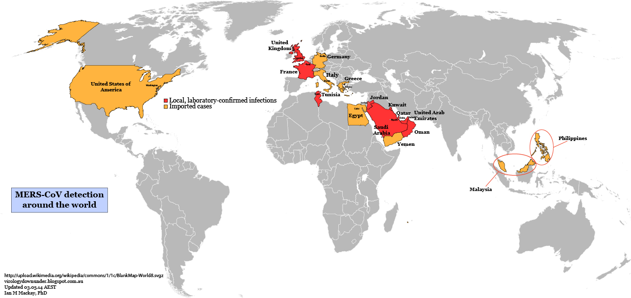
The bar along the top depict how much time passed between each 100 cases.
Click on chart to enlarge.


For a virus that is chugging along without the aid of any new genetic changes, and perhaps showing up more often (a) because of enhanced testing and/or (b) because of a large-scale breakdown in infection prevention and control (IPC), this curve sure does depict the possibility that we had no idea how much MERS-CoV was transmitting among the population. Still a poor transmitter compared to an influenzavirus, because we have seen a few larger MERS-CoV studies than show few to no MERS-CoV positives, but still more people positive than we thought.

Can we really lay this rate of climb at the feet of poor IPC alone? Wouldn't that also mean that every other respiratory virus would do this too? Perhaps not if MERS-CoV was the only one capable of causing acute pneumonia. It isn't. So shouldn't all hospitals always be full of acute pneumonia and respiratory disease among older males with comorbidities? These are modern hospitals after all. Also modern doctors with great training and skills acquired from all over the world. Perhaps poor IPC plus enhanced testing is an option? Maybe. Probably most likely when combined with an outbreak that starts in April for an unknown reason.

What about this option, which focusses on testing alone? Better levels of testing are at last showing it like it really is in the Arabian peninsula? This options proposes that we've been underestimating the ability of MERS-CoV to travel from person-to-person, all along. An underestimation driven by testing only the "tip of the iceberg" of disease and just watching the rest of the iceberg from a distance? What if severe disease is only found in already ill older males and most (granted, not all) of the rest get milder or unnoticeable disease but do get infected? Yes, in the past 2 weeks 5,000 samples have been tested in the Kingdom of Saudi Arabia (KSA) to yield ~140 MERS-CoV detections (~3%). After the 2012 Hajj, 154 pilgrims were tested by Gautret et al and, despite a high proportion with respiratory symptoms (83%), none were found positive for MERS-CoV. At 3% in Jeddah, testing of the Hajjis should have yielded ~4 detections among this cohort if the distribution of MERS-CoV was at this level all the time. In screening 5,065 cases and their contacts (family and healthcare workers) over a year from 1st-Oct-2012, Memish et al reported 106 detections (~2%) and no significant rise in case detection rates over that year. So a very similar proportion of positive cases, and both Jeddah and this larger study have similar numbers and a roughly similarly broad population being tested. Of course, even endemic human CoVs are not always detectable every year at the same site. Some have a biennial periodicity.

So perhaps 2-3% prevalence, similar to endemic CoVs, is the magic number for MERS-CoV 
positivity? Which just leaves the question, why weren't more Hajjis positive last year? Or was that just a testing thing too?

Just wondering out loud here.

MERS-CoV genomes remain stable amid Jeddah outbreak cases... [UPDATED]

Thanks to Prof Christian Drosten for answering a major question about the sudden large rise in Middle East respiratory syndrome coronavirus cases. He did so in an email some hour back.

Based on 3 genome sequences from 30 samples that Prof Drosten has been working with, no significant changes in the genome of Jeddah variants could be seen compared to previous sequences. The spike gene, a likely indicator of viral change, is "100 percent identical" to key regions from earlier MERS-CoV genome sequences.

This swings the focus for finding a reason for the outbreak in Jeddah,  Kingdom of Saudi Arabia (KSA) and the cluster in Abu Dhabi, the United Arab Emirates (UAE) back onto asking about:

  1. What happened to infection prevention and control?
    And why does this seem to happen in April (2013 and 2014)  in particular?
  2. Has recent increased testing simply uncovered that which was already happening?
    Perhaps there have always been more MERS-CoV infected people and a slightly better efficiency of transmission than we expected based on past efforts which mainly tested the sickest and most obvious of cases of MERS. 

I'm also wonder a couple of other things. 

As I've asked before, how were these samples selected? In a ProMED announcement a short time ago (thanks to Crawford Kilian/@Crof for pointing it out) we learned that the 3 complete genomes are from early on in the outbreak. So that raises the question of whether the virus has remained identical to earlier strains, later on in the outbreak? 

Also, what do other seasonal human endemic respiratory viruses do in the Arabian peninsula? Are these sorts of outbreaks, but due to other viruses like influenzaviruses, parainfluenzaviruses, rhinoviruses, respiratory syncytial virus, metapneumoviruses or other coronaviruses etc also happen to this extent and with similar clinical impact? What is the occurrence of acute pneumonia like in the KSA and UAE?

I thank Prof Drosten for his efforts, efficiency and rapid (sample were only dispatched to Germany 14-Apr and we have 3 complete genomes already!) and open communication. And I take special note of his comments...

"In light of some of the recent comments implicating delays in following up on the outbreak it is worth considering the timing and the workload associated with careful testing and internal confirmation done in Jeddah. It is also worth mentioning that samples were already dispatched from KSA MOH Riyadh to Germany on [14 Apr 2014] -- just about a week after receipt of samples in Jeddah regional laboratory, testing, internal confirmatory testing, and transport to Riyadh. After dispatch from Riyadh, samples were not successfully delivered through customs in Germany with an administrative process that took 3 days (17 Apr 2014). The sequencing work in Bonn started only on [22 Apr 2014] for the simple reason that most of the laboratory staff (including myself) have been on Easter holidays. Sequencing of further samples taken at later time points in Jeddah is underway."
ProMED 20140426.2432140

For my own part in communicating a message of delay, I'd like to add that, in my opinion, there really should be some local viral genotyping in place by now and that should have been producing 2014 MERS-CoV variant sequences all year. A great deal of fuss might have been side-stepped if we new the virus wasn't a factor in the outbreak.

For now, based on these 3 complete genomes and Prtof Drosten's 25 other partial spike gene sequences, there is no indication that viral change occurred early on in the Jeddah outbreak. No MERS-CoV v2.0 in town. No "mutant killer virus" headlines that can withstand scrutiny. We next await some detailed evolutionary analyses from Prof Andrew Rambaut who has these sequences. They are also available at http://www.virology-bonn.de

Sources...

  1. ProMED post.
    http://www.promedmail.org/direct.php?id=2432140


Like Us

Blog Archive